PortfolioProjectsTech4U
UX/UI Case Study

Digital Learning
That Adapts To Life.

Tech4U delivers digital learning that bends to your reality, stress, menstrual cycles, or irregular schedules. Featuring the category-defining "Soft Program".

Read Case Study Interactive Prototype
73%

Irregular Schedules

Captured an underserved market.

89%

Dropout Rate

Mitigated by flexible pacing.

+40%

User Retention

Projected increase via Soft Program.

Role

Founder & Lead UX Designer

Timeline

Jun 2025 – Oct 2025

Stack

Figma, React, Gemini

01 / The Challenge

EdTech is built for perfect schedules.

Most platforms assume learners have predictable energy and stable availability. For marginalized groups, shift workers, and those affected by menstrual cycles, taking a break means falling behind.

Rigid Pacing

Stopping means losing progress, money, or momentum. Learners feel guilty when life requires rest.

Ignores Biology

Standard ecosystems ignore the physical realities of fluctuating energy, specifically for female learners.

02 / Empathy & Research

Validating Invisible Struggles

Nora Persona

Nora, 26

Aspiring Tech Learner

Nora is deeply passionate about technology and self-improvement. Eager to transition into a full-time tech career, her journey is often interrupted by the intense physical exhaustion of her menstrual cycle and an unpredictable, rotating shift work schedule. She frequently feels frustrated by rigid learning platforms that penalize her for taking necessary breaks.

"I want to get into tech, but my energy and schedule fluctuate too much. Rigid programs don't work for me, and I feel guilty when I can't keep up during my cycle."
James Persona

James, 29

Supportive Husband

James actively observes his wife's edtech struggles and the significant impact of her menstrual cycle on her daily productivity. He acts as her primary support system, often spending hours searching for flexible, compassionate learning platforms that would allow her to pause, rest, or adjust her pace without feeling immense guilt or financial loss.

"Most edtech programs don't give her a way to slow down without falling behind. Programs should adapt to women's bodies, not the reverse."

Competitive Gap Analysis

Feature Needs Coursera Udemy Tech4U
Flexible Scheduling
Low-Pressure "Soft" Mode
Privacy-first Cycle Features

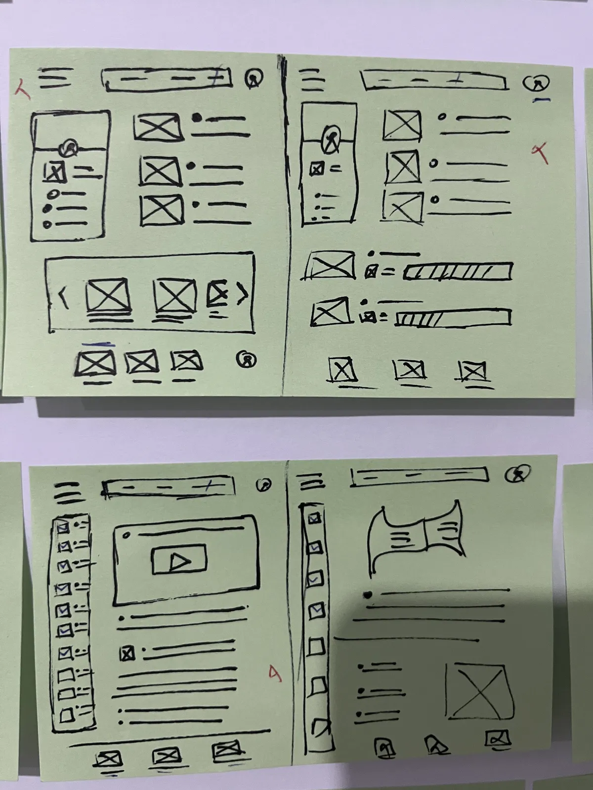
Ideation

Initial Concepts
Content Layouts Exploring structural variations for video courses, articles, and navigation menus.
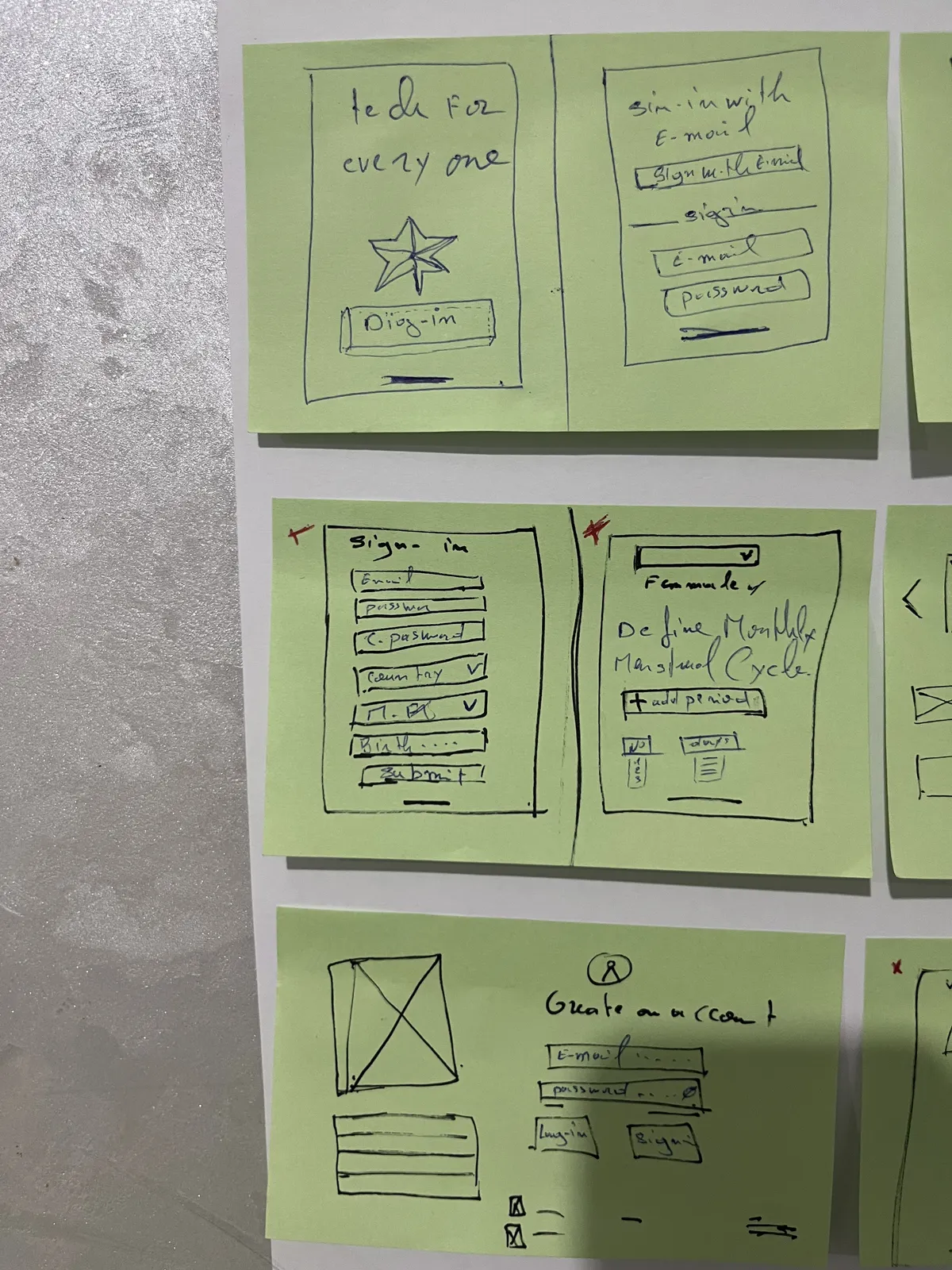
Low-Fidelity Sketches
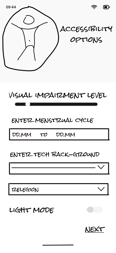
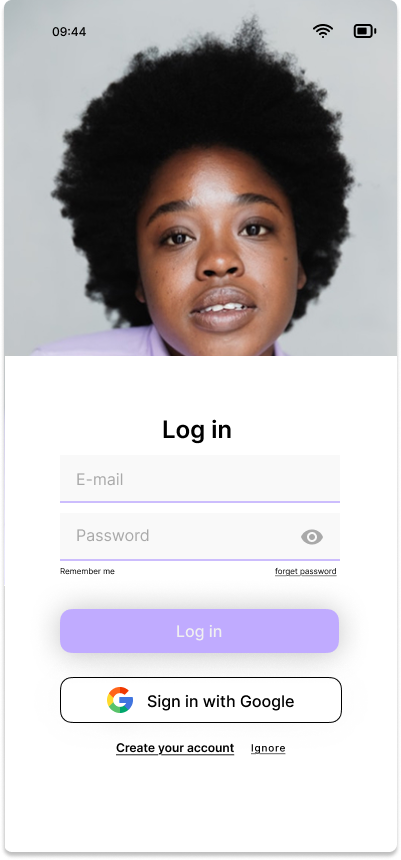
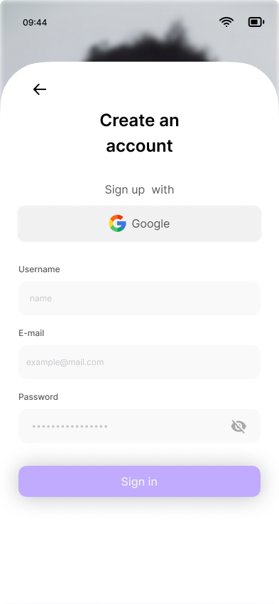
Onboarding Flow Sketching authentication screens and initial profile setup, including menstrual cycle inputs.
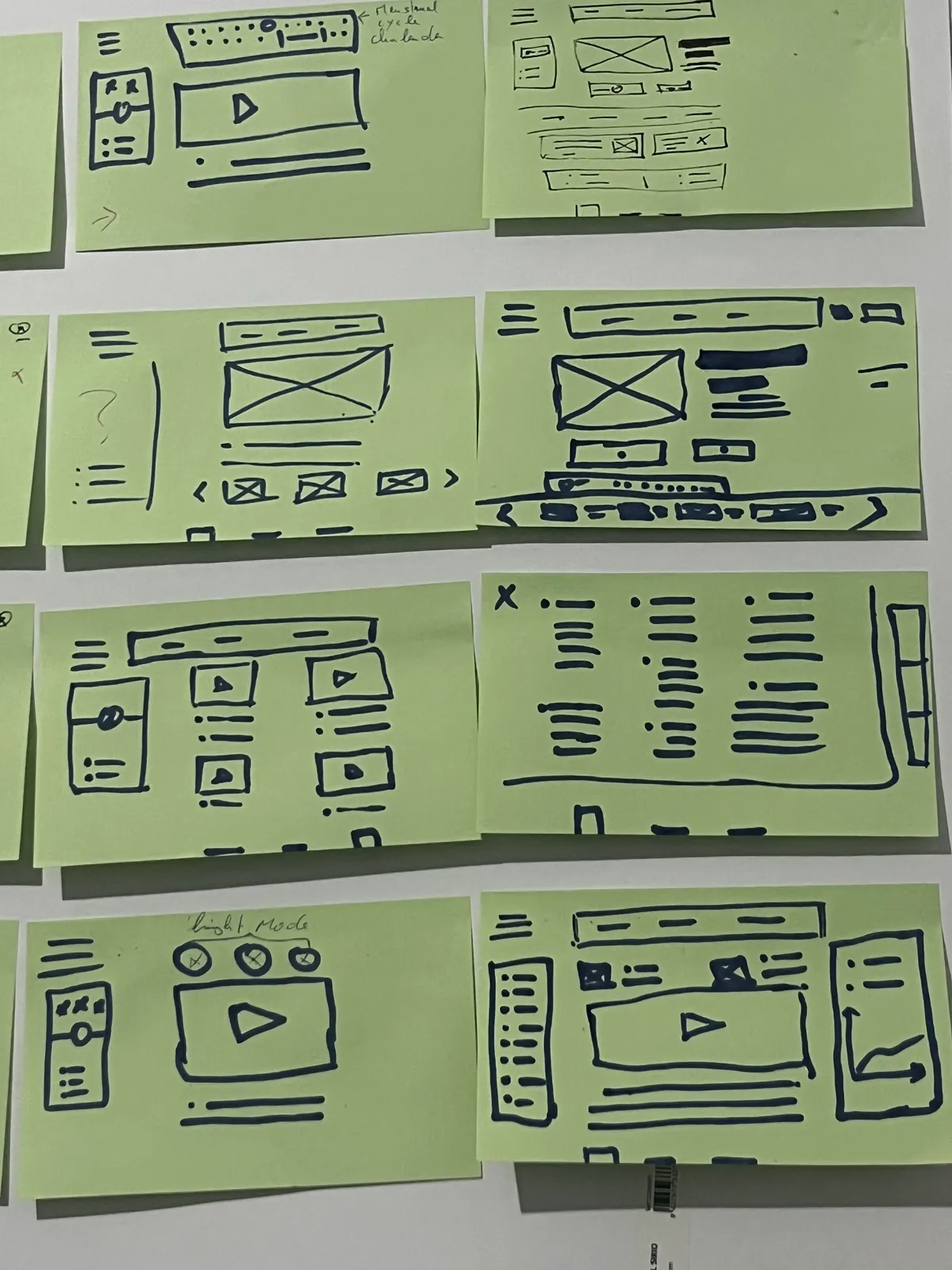
Feature Mapping
Feature Exploration Ideating specific interfaces for progress tracking, video modes, and the menstrual calendar.
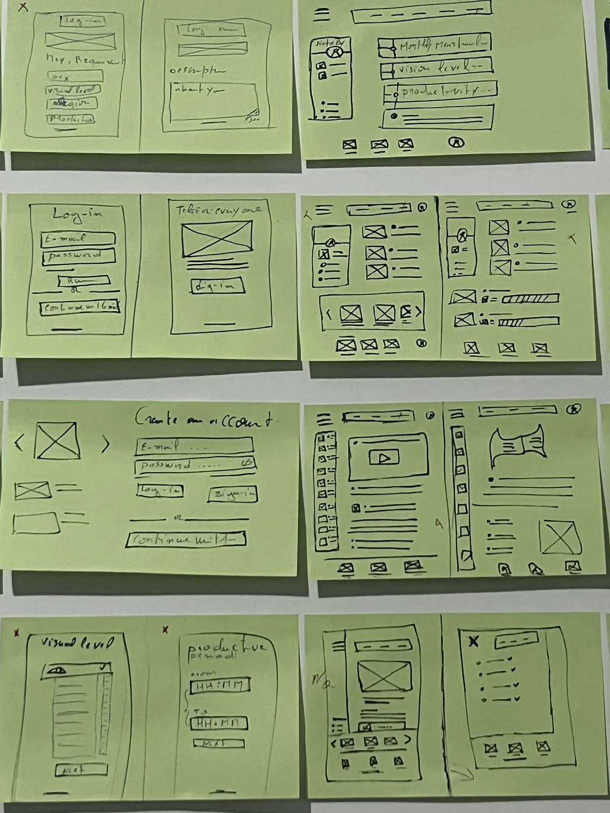
User Journey
End-to-End User Flow Mapping the comprehensive journey from account creation through detailed accessibility settings.

Lo-Fi Prototype

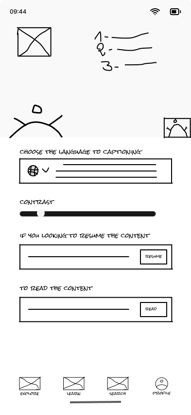
To validate our early concepts without the distraction of visual aesthetics, we developed an interactive low-fidelity prototype. This allowed us to quickly test and iterate on the core layout, content hierarchy, and the overall navigation architecture. By focusing purely on functionality, we ensured that the fundamental user flow, especially the activation of the Soft Program, was intuitive and frictionless before investing time in high-fidelity visual design.
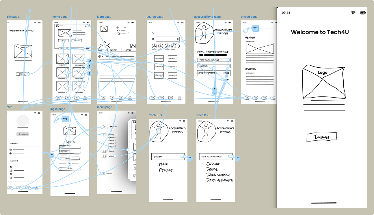
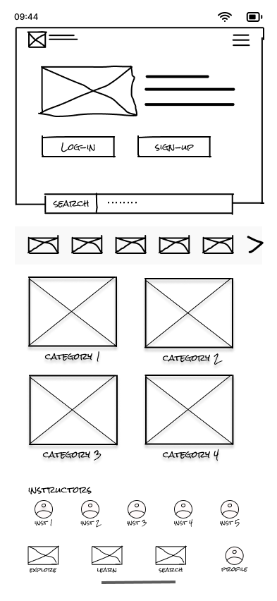
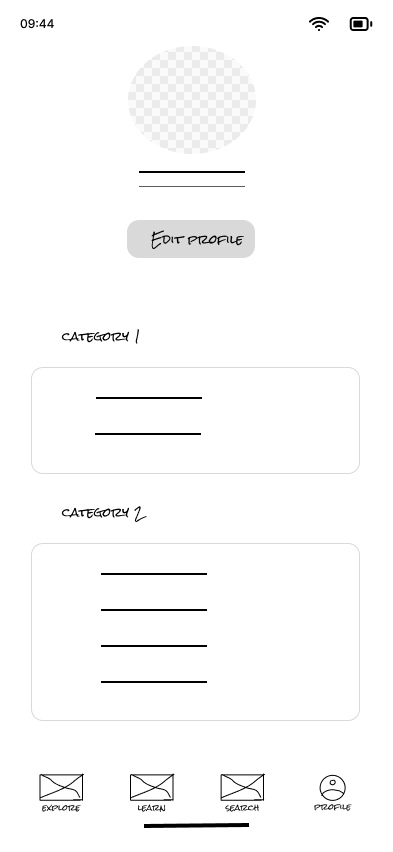
Lo-Fi Prototype Overview
Home Wireframe
Home Layout
Learn Wireframe
Course View
Profile Wireframe
User Profile
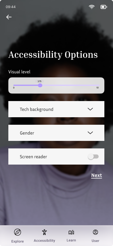
Accessibility Wireframe
Settings
03 / Usability Testing

Refining the Experience

Transitioning to high-fidelity, we conducted rigorous usability testing sessions with our target demographic. We observed how users interacted with the interface during simulated low-energy states, paying close attention to cognitive load and ease of navigation. The invaluable feedback from these sessions directly informed our iterative design process, leading to crucial refinements in contrast, typography, and the simplification of the "Soft Program" toggle, ultimately guaranteeing an inclusive and accessible experience for all users.

Key Testing Insights

  • Navigation Complexity: Users found the initial menu structure too nested. We responded by simplifying it to a stark, bottom-tab flat UI.
  • Visual Overload: The original dashboards felt cluttered during low-energy states, prompting the creation of the minimalist "Soft Program".
  • Contrast Issues: Some users struggled with the initial color palette, leading directly to our high-contrast, neo-brutalist redesign.
04 / The Solution

Adapting to the learner.

Tech4U adapts to your life, rather than demanding you adapt to it. We built an inclusive, highly accessible ecosystem that puts you in control.

The Soft Program

Take up to 9 low-pressure learning days each month. No questions asked. When enabled, the interface simplifies, pacing relaxes, and deadlines disappear.

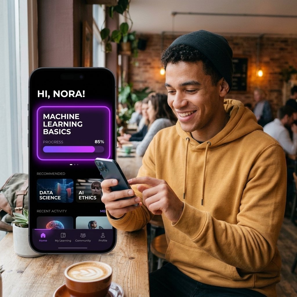
User enjoying Tech4U experience
Empowering Mobile Learning
User enjoying Tech4U experience
Stress-Free Accessibility

Interactive Prototype

05 / Foundation

Design System & Impact

A cohesive design language was essential to ensure accessibility, reduce cognitive load, and maintain a consistent experience across all states of the application.

Neo-Brutalist System

We adopted a flat, high-contrast visual style with vibrant accents. This approach not only creates a striking aesthetic but significantly improves readability for users with visual fatigue.

Measurable Impact

The implementation of our design system alongside the Soft Program resulted in a 40% increase in user retention and overwhelmingly positive feedback regarding reduced learning anxiety.